iPad Marine Navigation
The loss of my trusty, semi-retired MacBook Pro, as a result of its impromptu shower on the Round The Island Race, had forced me to consider alternative methods of chartplotting.
From Andrew Knights blog July 2011 – yachtarabella.blogspot.com
Memory-Map (Free)
The objective of the Memory-Map free app is to get you into an online chart store (Digital Map Store) and spending money. However, it’s not a cynical exercise: the App has excellent functionality, provided you’re prepared to invest modest time and effort in getting to know it. In addition, if you want to use your iPad for shore-bound navigation, Memory Map also works with topographic maps, among many others.
The instructions (annoyingly, only available online, albeit via a link from within the App) are clear enough, if unattractively presented as a large slab of text. Buying the charts from within the App is also easy, and competitively priced – about £25 gets you the Admiralty Raster Charts – yes, all 800 of them – for the UK and Ireland. Be aware that when you first purchase the UK and Ireland pack and download it, all you seem to get is a single chart covering the whole of the UK and Ireland. You haven’t been conned – you need to zoom in to the area you want the detailed charts for, and then click on the charts button and select ‘More Charts” from Digital Map Store to access the individual chart downloads.
The store is actually selling you a subscription – so you can delete charts from the iPad, and download them again, or indeed download further UK or Ireland charts, without paying again. Meanwhile, the ones that you have downloaded are cached and are therefore available on the iPad’s memory for all eternity, whether or not you have an internet connection and regardless whether you opt to pay for updates later, when they become available.
Do note, however, that the UK and Ireland pack is the only pack of marine charts available in Digital Map Store. If you want to undertake, say, a Channel crossing, you will only be able to access the Channel charts (for example, the Central Channel for a crossing from the Solent to Cherbourg). There appears to be no facility to obtain the detailed charts for the French coast or any other foreign destination.
Let’s start with the “iChart comparison.” The GPS location symbol isn’t especially elegant, but it is big, red and clear. That’s good enough for me.
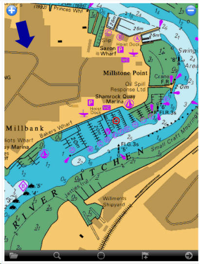
Recalling that the Memory-Map App is running Admiralty Rasters – my favourite – let’s get one piece of bad news out of the way early on: the charts are not interactive. You cannot click on a tidal diamond and pull up a nice curve and tide table, as you can in the Vector charts in Navionics HD or the (overlaid) Imray Raster charts. There’s nothing to click on. It’s annoying, but will come as little surprise to anyone who had been using Admiralty Rasters on Mac-based equipment for any length of time. The only solution – which I’ve worked with for years, so it doesn’t feel like a big deal to me personally – is to use a separate tides app or go online and use Admiralty Easytide (my usual port of call). It’s free of charge for predictions up to 6 days ahead, and beyond that, I use an almanac. If I’ve got a race coming up, like the RTI, I pull out the almanac and get the standard port tide times well in advance, so that I can mark-up the tidal atlas (scanned into PDF) and start thinking about strategy (uptide/downtide), which won’t be finalized until we get the wind forecasts in the immediate run-up to the event. Then, within the 6 days before the event, I go onto Easytide and get the prediction curves for all locations where the boat might end up going on race day, and paste them all into a Word document before converting it to PDF. It’s never really felt like an imposition, more like part of the satisfying task of working up the tac/nav and warming up my brain for the event.
Anyway, in-chart tidal data either is or isn’t a big deal for you. Assuming it isn’t, the rest of the news about the Memory-Map App is all pretty good. Inputting waypoints and creating routes is quick and easy. To create a waypoint, you simply tap on the Flag+ button on the toolbar, and a new waypoint appears as if by magic. As the shot below demonstrates, the new waypoint has two buttons: a blue arrow button, which opens a pop-up menu; and a green drag button. Tap and hold on the green button, and drag the waypoint to where you want it.
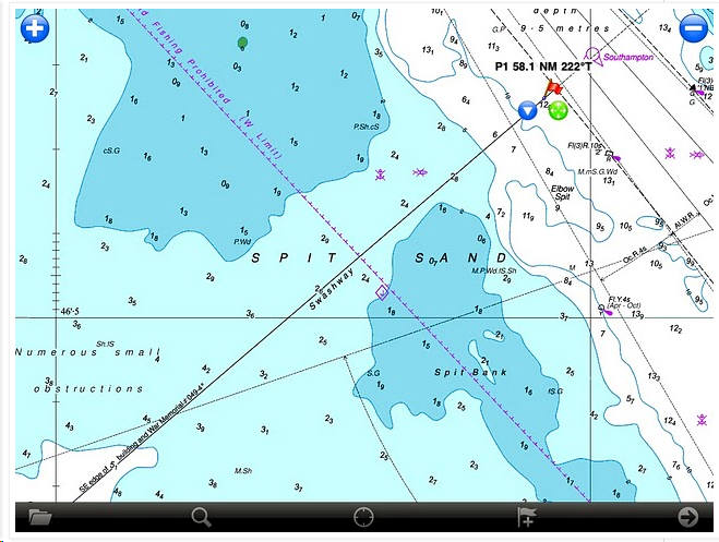
Let’s say you want to create a route. To do this, having created the first waypoint as shown above, you tap on the blue drop down arrow and select CREATE ROUTE from the menu that appears. Here’s our old friend the Swash Channel once again.
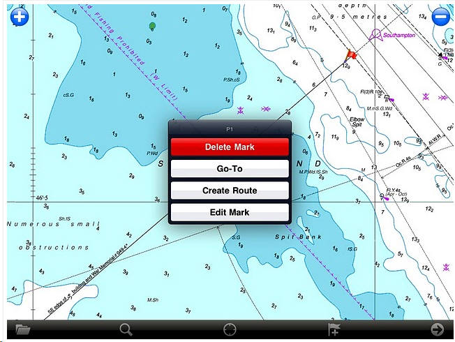
The first waypoint turns into a blue dot. You then just tap once to create each new waypoint, one after another, until your route is constructed. Each blue dot behaves just like a waypoint – if you tap on it, the same choice of a blue button and a green drag button appears – in the latter case, allowing you to drag the point around with your finger or stylus until it’s in a position you’re happy with. The route appears as a bold, dark blue line, and is clearly visible on the screen in broad daylight. There’s an option to change both the colour and the line style if you wish.
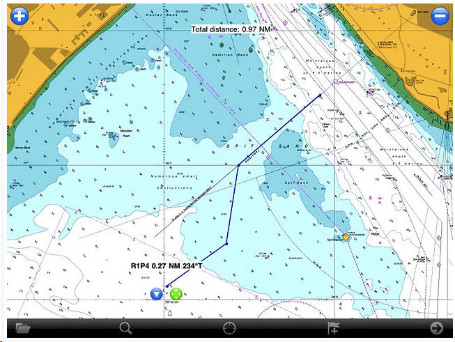
To follow the route, the route, select the first waypoint and tap on the blue menu button, then select FOLLOW ROUTE on the pop-up menu that appears.
And praise be, the App starts following the entire route, from start to finish, with no further user input is required. All you have to do is get to each waypoint, or within a preset proximity of it, and the route navigation automatically flips on to the next waypoint in sequence. I mean it’s not hard, is it? Why can’t Imray and Navionics do this, when a free App running twenty-five quid’s worth of charts can do it that easily?
That’s not all. Once you’ve activated the FOLLOW ROUTE function – or the GOTO function if you just want to navigate from where you are to a single waypoint – the Memory-Map App serves up a positive cornucopia of navigation data. This is so impressive that I am going to leave my kitchen now and jump on to Arabella for a sail, just so that you can see this function in action in the real world. Here we are, sailing up to the first waypoint of a simple route that I’ve created to take us down Southampton Water to the BP Hamble Oil Terminal jetty. (I’ve deactivated the track function, by the way, to declutter the image).
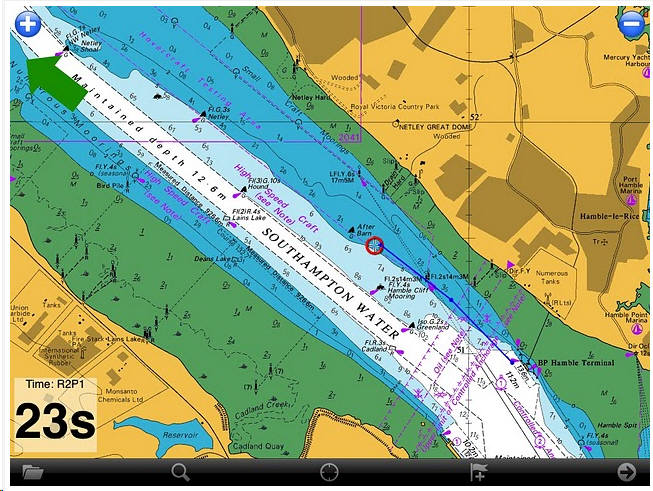
You may have to squint a bit, as the image is not full-size, but you can make out on the chart that, as we sail towards the first waypoint, it’s just off the port bow. Sure enough, the big arrow on the screen is pointing that way, telling us which way to steer, and there’s a countdown timer in the bottom left corner of the screen (R2P1 stands for Route 2, Point 1). It’s not clear from this screenshot, but when we pass the first waypoint, the route will automatically flip on the second, and so on until the route has been completed. There’s no necessity for the user to select the next waypoint and tap on GOTO.
Click the arrow button in the toolbar, bottom right, and the screen flips to provide a vast amount of data, like this. So much so, in fact, that I’m trying to work out how to populate some of the fields. But clearly, even the basic default set is pretty good. More impressive still, each of these fields can be customized.
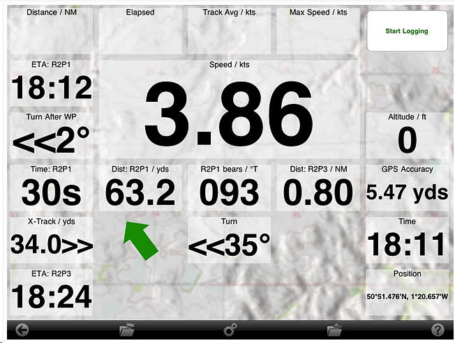
Not only can you resize each field (both large and small options appear in the shot above), but you can also select from a wide range of data with which to populate the fields. Tapping and holding each field opens up a menu button which, when clicked, launches a lengthy list of data options, like this. Bear in mind that on this screen, you’re only seeing a very small selection of the data available – the menu seems to scroll on and on forever.
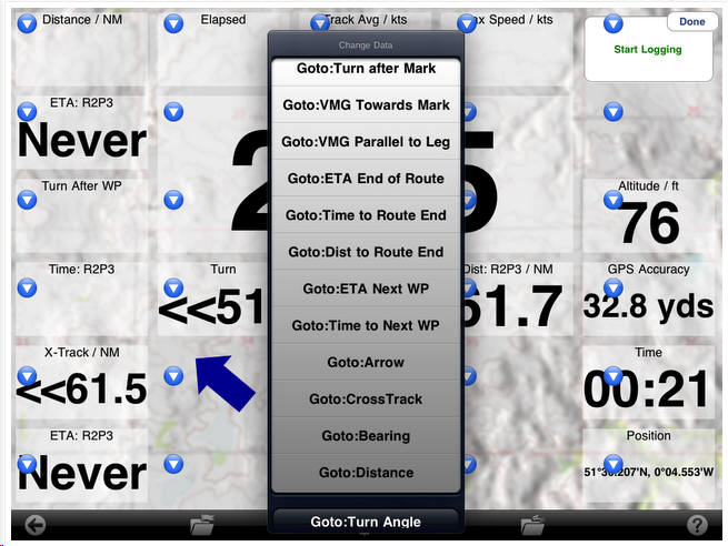
It’s difficult to imagine what further data the average user could possibly want, unless they were a dedicated racing tac/nav and required the functionality of software costing many, many times the price of this App and charts.
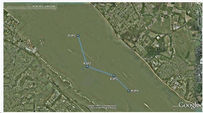
Finally, routes, waypoints and other data may be emailed from within the App for use in other programs. For example, here’s a route created in Memory-Map…
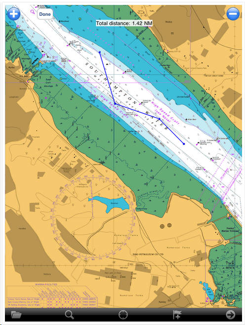
..and here it is opened in Google Earth on my MacBook Pro, after having been emailed. As I explain later, you can use this handy feature to swap routes, waypoints and tracks between different nav Apps on the iPad.
Verdict: The Memory-Map App is a truly excellent, competent product, representing real value for money. It’s straightforward to use, with just enough preference settings and options to describe it as customizable. Route-creation and route-following are ridiculously easy to set up, yet provide a tremendous range of route data. You can also import and export GPX files (via email). A really strong product at this price point, with just a few minor niggles. The instruction manual should be a help file within the App, not online, and the absence of in-App access to tidal data will annoy some users. Moreover, if you want to go foreign, the fact that only UK and Ireland charts are available will mean that you need to look elsewhere for detailed charts for your destination. On the other hand, the fact that this App may be used with OS and other types of map – available from the Digital Map Store – does give it a degree of flexibility that is absent in the other Apps reviewed here. If this were a magazine review, the Memory-Map App would get the “Best Budget Buy” stamp of approval. If you’re wondering why I say “Budget”, there are two reasons. First, at a total cost of £25 (for the free App plus the charts), this is a very cheap option, but don’t make the mistake of thinking it’s a poor relation. Second, if you don’t mind spending a bit more money.